Bootstrap Panel Example
Intro
Frequently we should segregate a few short (or not so much) components of content to make them stand up and get the guest's focus-- like mentioning several helpful features showing a selection of articles along with a short abstract and a solitary effective picture and so on and on.
So we need a convenient equipment to beautifully wrap our content in a attractive and flexible manner to get it pleasant and neat shown on our sites. In the latest version of the remarkably trendy flexible framework-- Bootstrap 3 we used mainly the Bootstrap Panel Body, thumbnail and well elements providing us box containers along with a faint border, quite rounded corners and eventually-- a slight 3d outcome. In the latest Bootstrap 4 framework, these disappear. They get got substituted collectively by the card piece claiming to be worthy of nearly everything the ancestors can do but only much better. So it's time to get to know it better.
How to use the Bootstrap Panel Group:
The cards are delicately styled containers capable of carrying practically any HTML content inside as well featuring a bunch of predefined designing option for properly showcasing its article. It also optionally can have a footer and a header.
If we want make a card we initially need a .card item to wrap the complete element up. Inside it distinct wrappers for the header .card-header, the real card content .card-block and the footer .card-footer shall take place and while the header and footer are quite optional and can be omitted if you don't require them the .card-block is the vital component-- it suitably wraps your content offering some subtle padding around.
Inside the .card-block element you can have a title carrying the class .card-title which may be added to theh1-- h6 headings in addition to a normal <div> and fo course -- come text covered in a paragraph with the .card-text class. If you decide to add some hyperlinks as well-- assign them the .card-link class to have them certainly separated for better user interaction.
The contextual color scheme classes could be utilized to further style your whole card sections easily-- just assign a .card- ~ one of the contextual colours here like primary, success, info or danger here ~ to the primary .card wrapper and if the background becomes a bit overly darkened for the content to be distinct enough-- also add the .card-inverse class to invert the text color. You can also style only the border colour using the contextual scheme-- this gets done by assigning the .card-outline- ~ the wanted shade ~ class again to the primary .card item.
As stated above the .card-block appears to cover the content leaving a notable padding around it. But the moment it comes to pics this might want to prevent this and have the pic expanded the whole width of the item.
To have this look simply put the <div class="img"><img></div> tag outside the .card-block thus you prevent the paddings eventually including style=" width:100%;" making certain this will resize correctly always filling in its container.
A few words regarding the design-- cards will occupy the entire horizontal area available by default thus it's a good idea limiting this by placing them inside some grid elements. By doing this you can achieve their predictable behavior.
Some good example
Cards are designed with as little markup and styles as possible, but still manage to provide a lot of management and modification. Constructed using flexbox, they present easy placement and blend well with other Bootstrap elements.
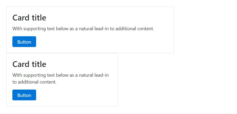
Here is a model of a basic card with blended content and a fixed width. Cards have no preset width to start, so they'll typically fill the entire width of its parent element. This is effortlessly modified with a variety of sizing choices.
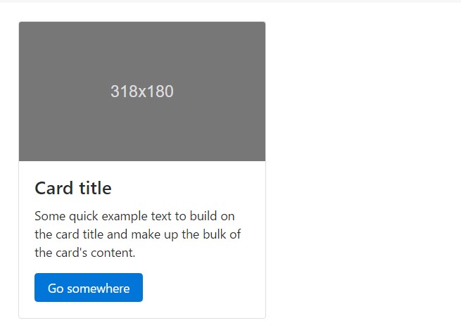
<div class="card" style="width: 20rem;">
  <div class="img"><img class="card-img-top" src="..." alt="Card picture caption"></div>
  <div class="card-block">
    <h4 class="card-title">Card caption</h4>
    <p class="card-text">Some fast sample message to build on the card title as well as compose the bulk of the card's material.</p>
    <a href="#" class="btn btn-primary">Go somewhere</a>
  </div>
</div>
Web information kinds
Cards support a wide variety of content, featuring pictures, text message, list groups, links, and more. Below are examples of what's provided.
Blocks
The building block of a card is the .card-block. Use it whenever you require a padded section within a card.
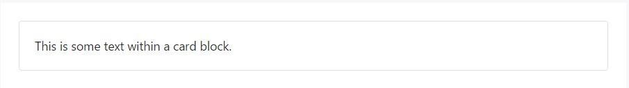
<div class="card">
  <div class="card-block">
    This is some message in a card block.
  </div>
</div>
Names, information, and web links
Subtitles are utilized by including a .card-subtitle to a <h*> tag. In case the .card-title and the .card-subtitle items are put in a .card-block element, the card title and subtitle are aligned well.
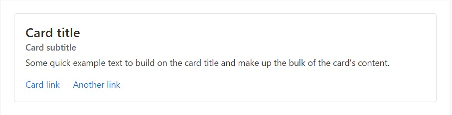
<div class="card">
  <div class="card-block">
    <h4 class="card-title">Card title</h4>
    <h6 class="card-subtitle mb-2 text-muted">Card subtitle</h6>
    <p class="card-text">Some fast example message to improve the card title and compose the mass of the card's content.</p>
    <a href="#" class="card-link">Card link</a>
    <a href="#" class="card-link">Another link</a>
  </div>
</div>
Illustrations
.card-img-top puts an image to the top of the card. With .card-text, text is included in the card. Text inside .card-text may also be styled with the regular HTML tags.
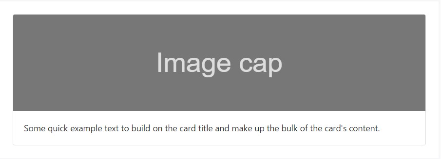
<div class="card">
  <div class="img"><img class="card-img-top" src="..." alt="Card picture cap"></div>
  <div class="card-block">
    <p class="card-text">Some fast example message to build on the card title and also compose the bulk of the card's web content.</p>
  </div>
</div>
List groups
Create lists of content in a card by a flush list group.
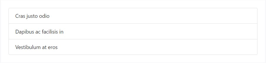
<div class="card">
  <ul class="list-group list-group-flush">
    <li class="list-group-item">Cras justo odio</li>
    <li class="list-group-item">Dapibus ac facilisis in</li>
    <li class="list-group-item">Vestibulum at eros</li>
  </ul>
</div>
Mix up and fit different web content types to develop the card you desire, or throw everything in there. Revealed here are picture layouts, blocks, notification varieties, and a list group - all wrapped in a fixed-width card.
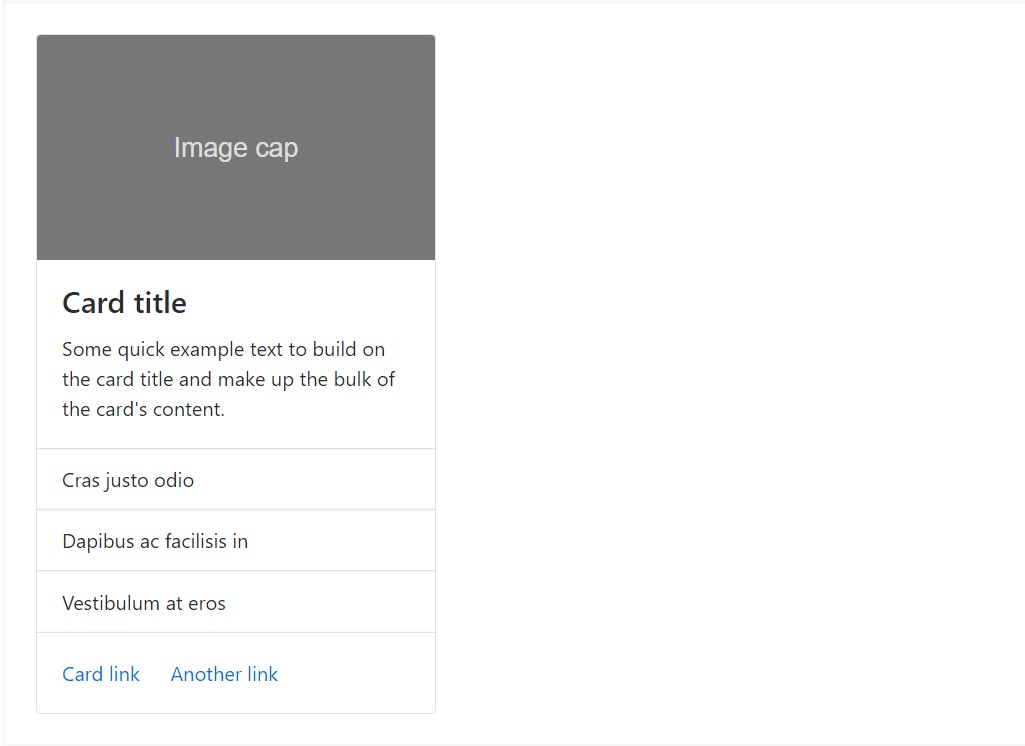
<div class="card" style="width: 20rem;">
  <div class="img"><img class="card-img-top" src="..." alt="Card image cap"></div>
  <div class="card-block">
    <h4 class="card-title">Card title</h4>
    <p class="card-text">Some quick example text to build on the card title and make up the bulk of the card's content.</p>
  </div>
  <ul class="list-group list-group-flush">
    <li class="list-group-item">Cras justo odio</li>
    <li class="list-group-item">Dapibus ac facilisis in</li>
    <li class="list-group-item">Vestibulum at eros</li>
  </ul>
  <div class="card-block">
    <a href="#" class="card-link">Card link</a>
    <a href="#" class="card-link">Another link</a>
  </div>
</div>
Header and footer
Include an optional header and/or footer in a card.
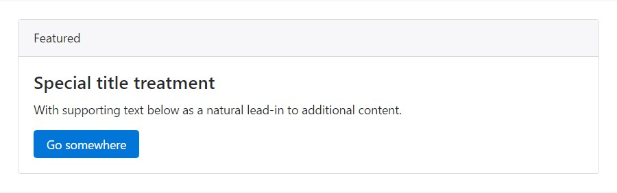
<div class="card">
<div class="card-header">
Featured
</div>
<div class="card-block">
<h4 class="card-title">Unique title therapy</h4>
<p class="card-text">With supporting message below as an all-natural lead-in to extra content.</p>
<a href="#" class="btn btn-primary">Go someplace</a>
</div>
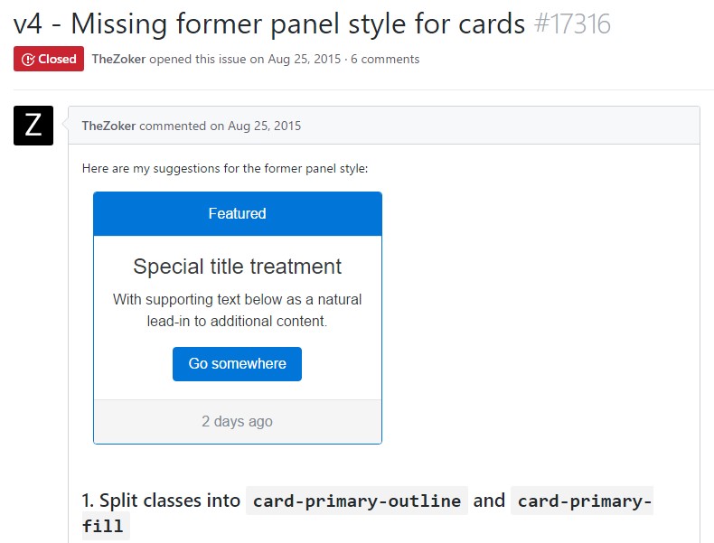
</div>Card headers could be styled by adding .card-header to <h*> components.
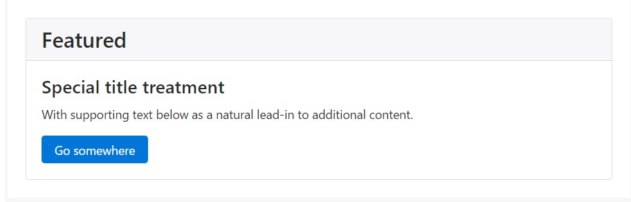
<div class="card">
  <h3 class="card-header">Featured</h3>
  <div class="card-block">
    <h4 class="card-title">Special title treatment</h4>
    <p class="card-text">With supporting message below as a natural lead-in to extra content.</p>
    <a href="#" class="btn btn-primary">Go someplace</a>
  </div>
</div>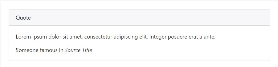
<div class="card">
  <div class="card-header">
    Quote
  </div>
  <div class="card-block">
    <blockquote class="card-blockquote">
      <p>Lorem ipsum dolor sit amet, consectetur adipiscing elit. Integer posuere erat a ante.</p>
      <footer>Someone famous in <cite title="Source Title">Source Title</cite></footer>
    </blockquote>
  </div>
</div>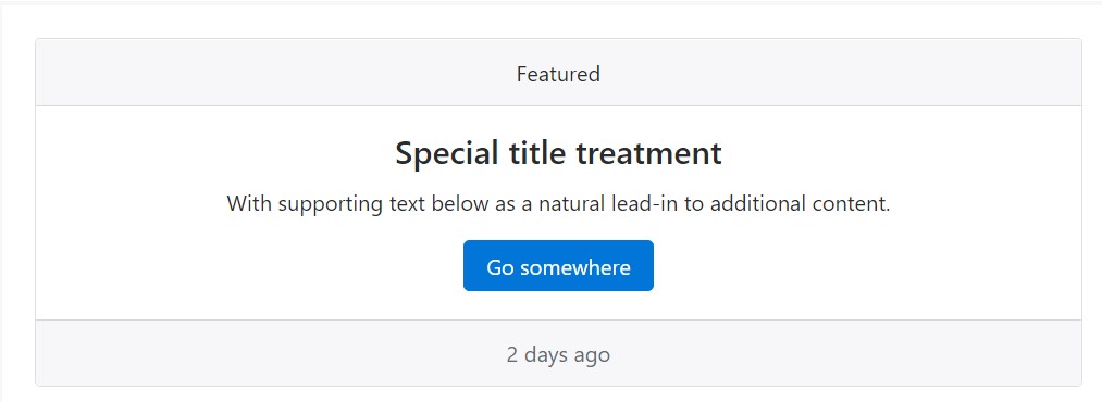
<div class="card text-center">
  <div class="card-header">
    Featured
  </div>
  <div class="card-block">
    <h4 class="card-title">Special title treatment</h4>
    <p class="card-text">With supporting text below as an all-natural lead-in to extra material.</p>
    <a href="#" class="btn btn-primary">Go someplace</a>
  </div>
  <div class="card-footer text-muted">
    2 days ago
  </div>
</div>
Proportions
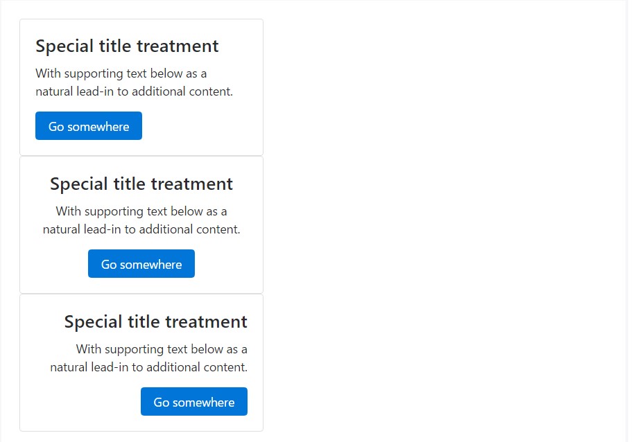
Cards have no certain width to start, so they should be 100% wide except something else claimed. You can alter this as required with customized CSS, grid classes, grid Sass mixins, or utilities.
Operating grid markup
Using the grid, wrap cards in columns and rows as needed.
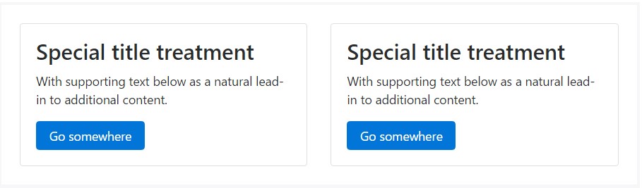
<div class="row">
  <div class="col-sm-6">
    <div class="card">
      <div class="card-block">
        <h3 class="card-title">Special title treatment</h3>
        <p class="card-text">With supporting text below as a natural lead-in to additional content.</p>
        <a href="#" class="btn btn-primary">Go somewhere</a>
      </div>
    </div>
  </div>
</div>
Working with utilities
Use handful of readily available sizing utilities to rapidly establish a card's width.
<div class="card w-75">
  <div class="card-block">
    <h3 class="card-title">Card title</h3>
    <p class="card-text">With supporting text below as a natural lead-in to additional content.</p>
    <a href="#" class="btn btn-primary">Button</a>
  </div>
</div>

<div class="card w-50">
  <div class="card-block">
    <h3 class="card-title">Card title</h3>
    <p class="card-text">With sustaining message listed below as an all-natural lead-in to extra web content.</p>
    <a href="#" class="btn btn-primary">Button</a>
  </div>
</div>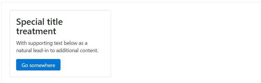
<div class="card" style="width: 20rem;">
  <div class="card-block">
    <h3 class="card-title">Special title treatment</h3>
    <p class="card-text">With supporting text below as a natural lead-in to added material.</p>
    <a href="#" class="btn btn-primary">Go somewhere</a>
  </div>
</div>
Message placing
You can swiftly transform the text alignment of any kind of card-- in its totality or specific components-- with text align classes.
<div class="card" style="width: 20rem;">
  <div class="card-block">
    <h4 class="card-title">Special title treatment</h4>
    <p class="card-text">With supporting text below as a natural lead-in to additional content.</p>
    <a href="#" class="btn btn-primary">Go somewhere</a>
  </div>
</div>

<div class="card text-center" style="width: 20rem;">
  <div class="card-block">
    <h4 class="card-title">Special title treatment</h4>
    <p class="card-text">With supporting text below as a natural lead-in to additional content.</p>
    <a href="#" class="btn btn-primary">Go somewhere</a>
  </div>
</div>

<div class="card text-right" style="width: 20rem;">
  <div class="card-block">
    <h4 class="card-title">Special title treatment</h4>
    <p class="card-text">With supporting text below as a natural lead-in to additional content.</p>
    <a href="#" class="btn btn-primary">Go somewhere</a>
  </div>
</div>
Site navigation
Include some navigation to a card's header (or block) with Bootstrap's nav components.
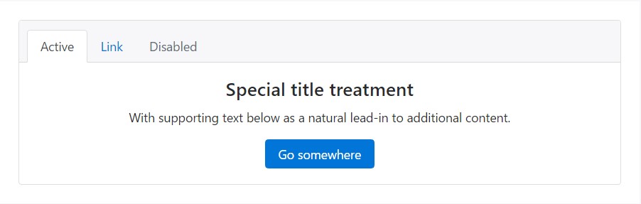
<div class="card text-center">
  <div class="card-header">
    <ul class="nav nav-tabs card-header-tabs">
      <li class="nav-item">
        <a class="nav-link active" href="#">Active</a>
      </li>
      <li class="nav-item">
        <a class="nav-link" href="#">Link</a>
      </li>
      <li class="nav-item">
        <a class="nav-link disabled" href="#">Disabled</a>
      </li>
    </ul>
  </div>
  <div class="card-block">
    <h4 class="card-title">Special title treatment</h4>
    <p class="card-text">With supporting text below as a natural lead-in to additional content.</p>
    <a href="#" class="btn btn-primary">Go somewhere</a>
  </div>
</div>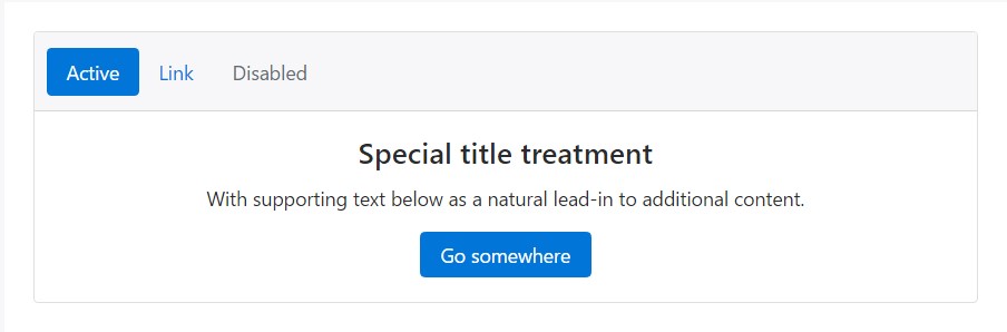
<div class="card text-center">
  <div class="card-header">
    <ul class="nav nav-pills card-header-pills">
      <li class="nav-item">
        <a class="nav-link active" href="#">Active</a>
      </li>
      <li class="nav-item">
        <a class="nav-link" href="#">Link</a>
      </li>
      <li class="nav-item">
        <a class="nav-link disabled" href="#">Disabled</a>
      </li>
    </ul>
  </div>
  <div class="card-block">
    <h4 class="card-title">Special title treatment</h4>
    <p class="card-text">With supporting text below as a natural lead-in to additional content.</p>
    <a href="#" class="btn btn-primary">Go somewhere</a>
  </div>
</div>
Pictures
Cards feature a few possibilities for operating using images. Select from attaching "image caps" at either end of a card, overlaying pictures with card content, or simply inserting the image in a card.
Illustration caps
Just like footers and headers, cards may contain bottom and top "image caps"-- pictures at the top or bottom of a card.
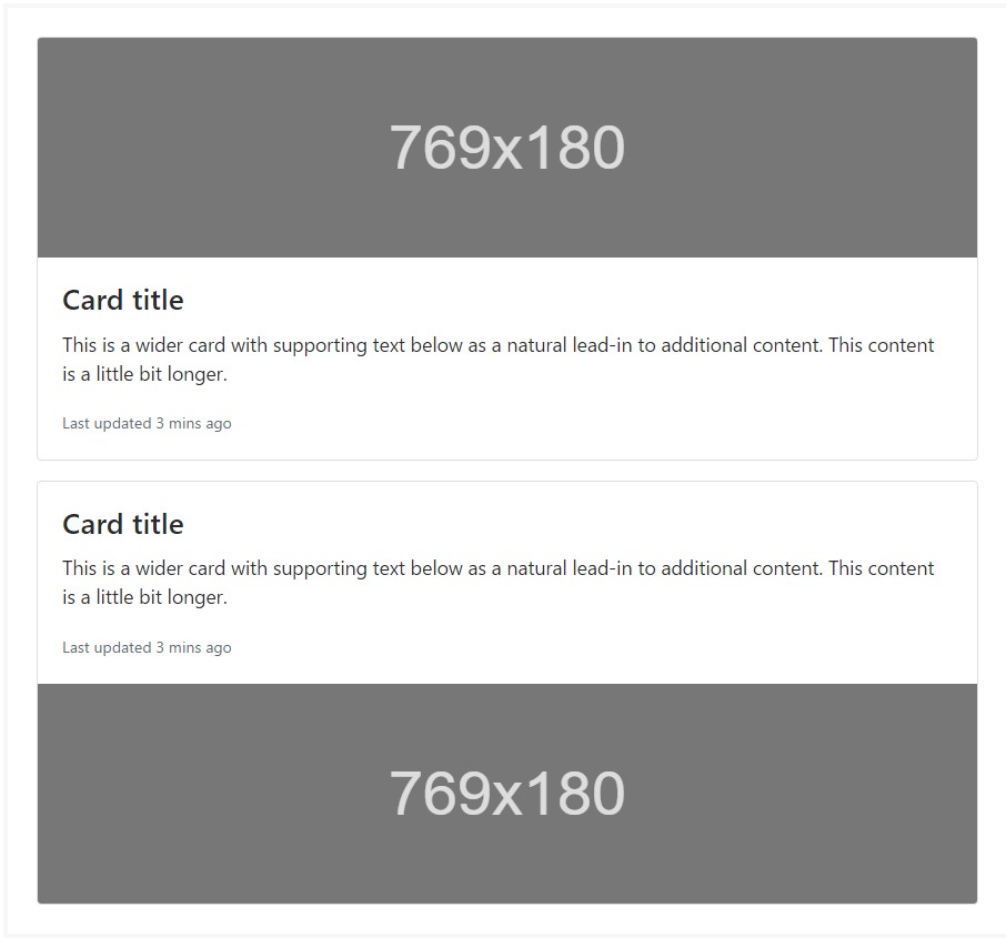
<div class="card mb-3">
  <div class="img"><img class="card-img-top" src="..." alt="Card image cap"></div>
  <div class="card-block">
    <h4 class="card-title">Card title</h4>
    <p class="card-text">This is a wider card with supporting text below as a natural lead-in to additional content. This content is a little bit longer.</p>
    <p class="card-text"><small class="text-muted">Last updated 3 mins ago</small></p>
  </div>
</div>
<div class="card">
  <div class="card-block">
    <h4 class="card-title">Card title</h4>
    <p class="card-text">This is a wider card with supporting text below as a natural lead-in to additional content. This content is a little bit longer.</p>
    <p class="card-text"><small class="text-muted">Last updated 3 mins ago</small></p>
  </div>
  <div class="img"><img class="card-img-bottom" src="..." alt="Card image cap"></div>
</div>
Image cover
Turn an image into a card foundation and overlay your card's text. Basing on the image, you may or may not require .card-inverse (see below).
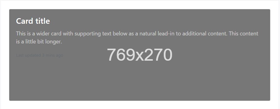
<div class="card card-inverse">
  <div class="img"><img class="card-img" src="..." alt="Card image"></div>
  <div class="card-img-overlay">
    <h4 class="card-title">Card title</h4>
    <p class="card-text">This is a wider card with supporting text below as a natural lead-in to additional content. This content is a little bit longer.</p>
    <p class="card-text"><small class="text-muted">Last updated 3 mins ago</small></p>
  </div>
</div>
Card variations
Cards involve different options for modifying their backgrounds, borders, and color.
Inverted text
By default, cards use dark text and assume a light background. You can alter this by toggling the color of text within, as well as that of the card's subcomponents, using .card-inverse. Specify a dark background-color and border-color to go with it.
You may also use .card-inverse having the contextual backgrounds variants.
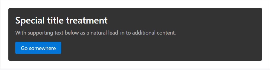
<div class="card card-inverse" style="background-color: #333; border-color: #333;">
  <div class="card-block">
    <h3 class="card-title">Special title treatment</h3>
    <p class="card-text">With supporting text below as a natural lead-in to additional content.</p>
    <a href="#" class="btn btn-primary">Go somewhere</a>
  </div>
</div>
Background alternatives
Cards include their own variant classes for rapidly modifying the background-color and border-color of a card. Darker colors require the use of .card-inverse.
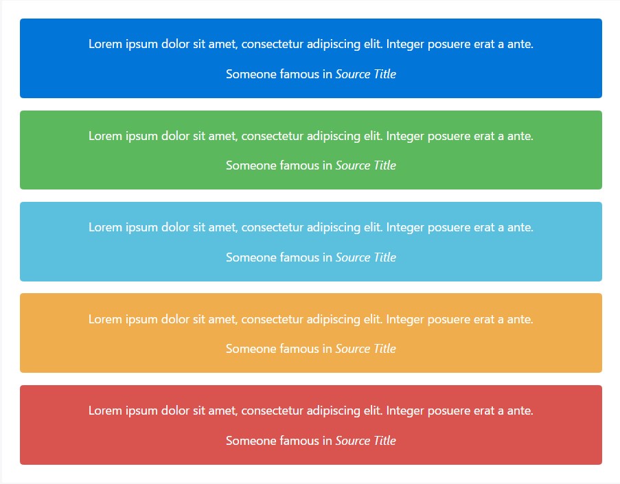
<div class="card card-inverse card-primary mb-3 text-center">
  <div class="card-block">
    <blockquote class="card-blockquote">
      <p>Lorem ipsum dolor sit amet, consectetur adipiscing elit. Integer posuere erat a ante.</p>
      <footer>Someone famous in <cite title="Source Title">Source Title</cite></footer>
    </blockquote>
  </div>
</div>
<div class="card card-inverse card-success mb-3 text-center">
  <div class="card-block">
    <blockquote class="card-blockquote">
      <p>Lorem ipsum dolor sit amet, consectetur adipiscing elit. Integer posuere erat a ante.</p>
      <footer>Someone famous in <cite title="Source Title">Source Title</cite></footer>
    </blockquote>
  </div>
</div>
<div class="card card-inverse card-info mb-3 text-center">
  <div class="card-block">
    <blockquote class="card-blockquote">
      <p>Lorem ipsum dolor sit amet, consectetur adipiscing elit. Integer posuere erat a ante.</p>
      <footer>Someone famous in <cite title="Source Title">Source Title</cite></footer>
    </blockquote>
  </div>
</div>
<div class="card card-inverse card-warning mb-3 text-center">
  <div class="card-block">
    <blockquote class="card-blockquote">
      <p>Lorem ipsum dolor sit amet, consectetur adipiscing elit. Integer posuere erat a ante.</p>
      <footer>Someone famous in <cite title="Source Title">Source Title</cite></footer>
    </blockquote>
  </div>
</div>
<div class="card card-inverse card-danger text-center">
  <div class="card-block">
    <blockquote class="card-blockquote">
      <p>Lorem ipsum dolor sit amet, consectetur adipiscing elit. Integer posuere erat a ante.</p>
      <footer>Someone famous in <cite title="Source Title">Source Title</cite></footer>
    </blockquote>
  </div>
</div>
Conveying meaning to assistive modern technologies
Using color to bring in meaning only provides a visual indication, that will not be shared to users of assistive technologies-- such as screen readers. Ensure that info signified by the color is either obvious from the material itself (e.g. the visible text), or is featured through alternative means, such as extra content hidden with the .sr-only class.
Outline cards
In need of a colored card, but not the hefty background colors they give? Change the default modifier classes with the .card-outline-* ones to design just the border-color of a card.
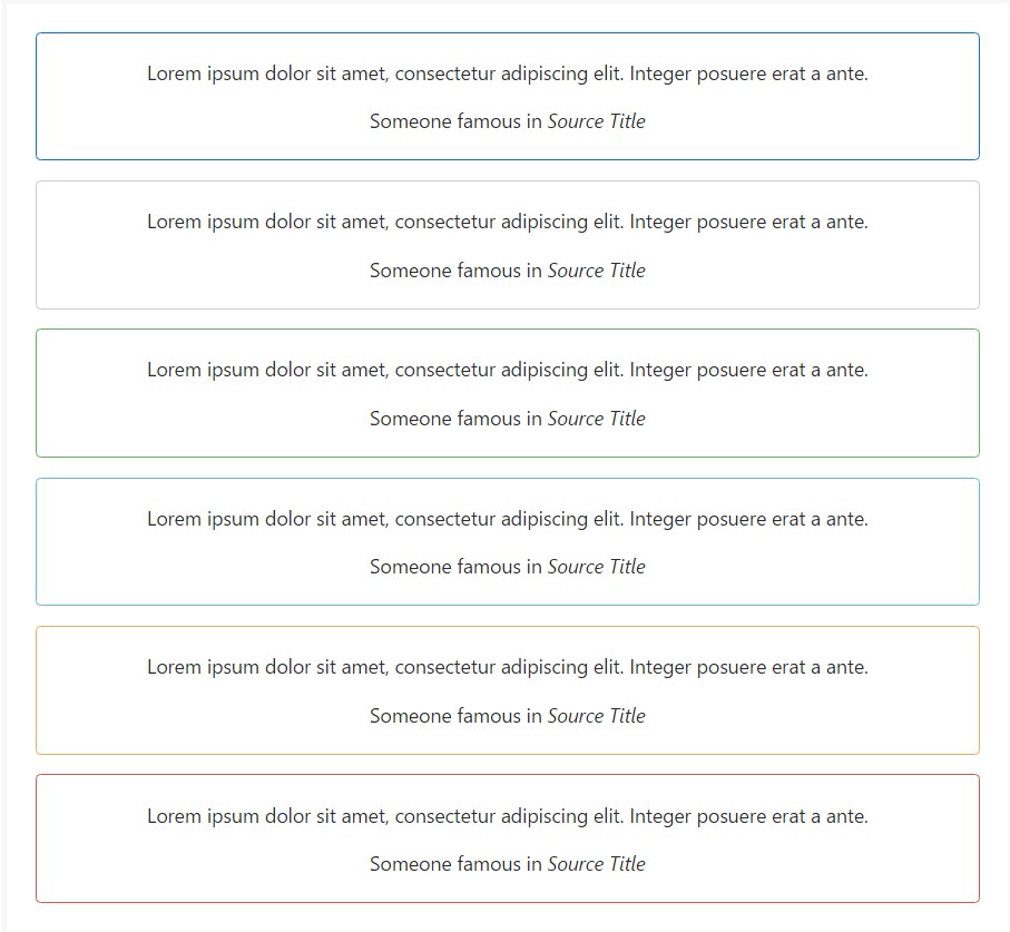
<div class="card card-outline-primary mb-3 text-center">
  <div class="card-block">
    <blockquote class="card-blockquote">
      <p>Lorem ipsum dolor sit amet, consectetur adipiscing elit. Integer posuere erat a ante.</p>
      <footer>Someone famous in <cite title="Source Title">Source Title</cite></footer>
    </blockquote>
  </div>
</div>
<div class="card card-outline-secondary mb-3 text-center">
  <div class="card-block">
    <blockquote class="card-blockquote">
      <p>Lorem ipsum dolor sit amet, consectetur adipiscing elit. Integer posuere erat a ante.</p>
      <footer>Someone famous in <cite title="Source Title">Source Title</cite></footer>
    </blockquote>
  </div>
</div>
<div class="card card-outline-success mb-3 text-center">
  <div class="card-block">
    <blockquote class="card-blockquote">
      <p>Lorem ipsum dolor sit amet, consectetur adipiscing elit. Integer posuere erat a ante.</p>
      <footer>Someone famous in <cite title="Source Title">Source Title</cite></footer>
    </blockquote>
  </div>
</div>
<div class="card card-outline-info mb-3 text-center">
  <div class="card-block">
    <blockquote class="card-blockquote">
      <p>Lorem ipsum dolor sit amet, consectetur adipiscing elit. Integer posuere erat a ante.</p>
      <footer>Someone famous in <cite title="Source Title">Source Title</cite></footer>
    </blockquote>
  </div>
</div>
<div class="card card-outline-warning mb-3 text-center">
  <div class="card-block">
    <blockquote class="card-blockquote">
      <p>Lorem ipsum dolor sit amet, consectetur adipiscing elit. Integer posuere erat a ante.</p>
      <footer>Someone famous in <cite title="Source Title">Source Title</cite></footer>
    </blockquote>
  </div>
</div>
<div class="card card-outline-danger text-center">
  <div class="card-block">
    <blockquote class="card-blockquote">
      <p>Lorem ipsum dolor sit amet, consectetur adipiscing elit. Integer posuere erat a ante.</p>
      <footer>Someone famous in <cite title="Source Title">Source Title</cite></footer>
    </blockquote>
  </div>
</div>
Card placement
Besides styling the content within cards, Bootstrap 4 offers a number of options for laying out collection of cards. For the present being, these format choices are not yet responsive.
Card groups
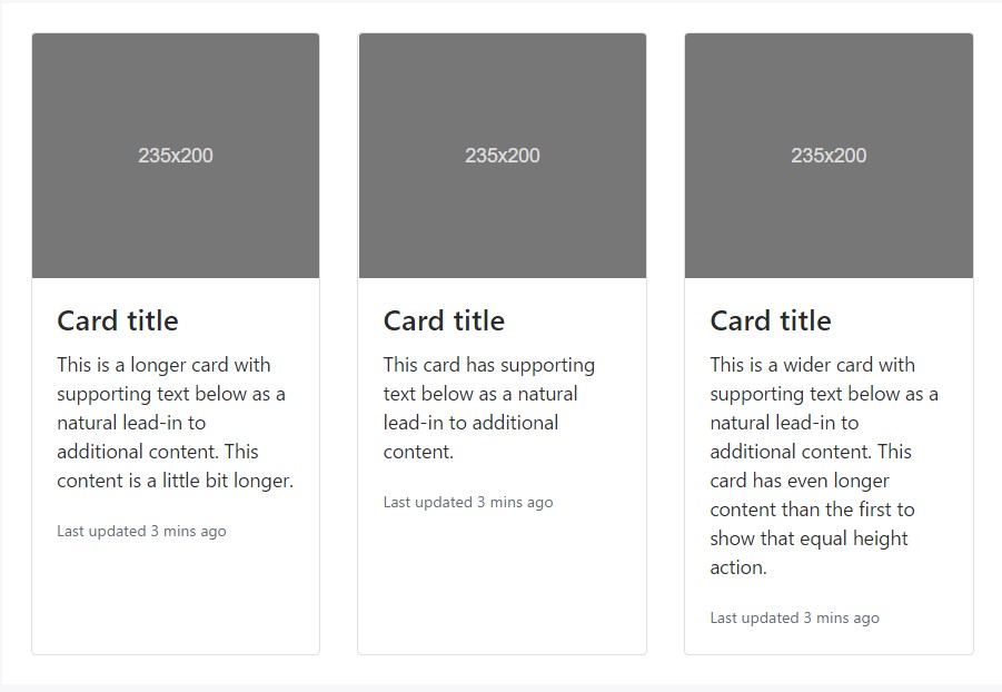
Use card groups to make cards as a single, attached element with identical width and height columns. Card groups work with display: flex; to achieve their uniform sizing.
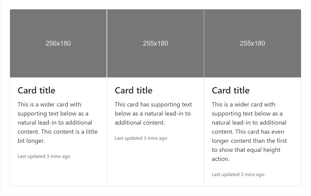
<div class="card-group">
  <div class="card">
    <div class="img"><img class="card-img-top" src="..." alt="Card image cap"></div>
    <div class="card-block">
      <h4 class="card-title">Card title</h4>
      <p class="card-text">This is a wider card with supporting text below as a natural lead-in to additional content. This content is a little bit longer.</p>
      <p class="card-text"><small class="text-muted">Last updated 3 mins ago</small></p>
    </div>
  </div>
  <div class="card">
    <div class="img"><img class="card-img-top" src="..." alt="Card image cap"></div>
    <div class="card-block">
      <h4 class="card-title">Card title</h4>
      <p class="card-text">This card has supporting text below as a natural lead-in to additional content.</p>
      <p class="card-text"><small class="text-muted">Last updated 3 mins ago</small></p>
    </div>
  </div>
  <div class="card">
    <div class="img"><img class="card-img-top" src="..." alt="Card image cap"></div>
    <div class="card-block">
      <h4 class="card-title">Card title</h4>
      <p class="card-text">This is a wider card with supporting text below as a natural lead-in to additional content. This card has even longer content than the first to show that equal height action.</p>
      <p class="card-text"><small class="text-muted">Last updated 3 mins ago</small></p>
    </div>
  </div>
</div>
When using card groups with footers, their content is going to automatically line up.
<div class="card-group">
<div class="card">
<div class="img"><img class="card-img-top" src="..." alt="Card image cap"></div>
<div class="card-block">
<h4 class="card-title">Card title</h4>
<p class="card-text">This is a wider card with supporting text below as a natural lead-in to additional content. This content is a little bit longer.</p>
</div>
<div class="card-footer">
<small class="text-muted">Last updated 3 mins ago</small>
</div>
</div>
<div class="card">
<div class="img"><img class="card-img-top" src="..." alt="Card image cap"></div>
<div class="card-block">
<h4 class="card-title">Card title</h4>
<p class="card-text">This card has supporting text below as a natural lead-in to additional content.</p>
</div>
<div class="card-footer">
<small class="text-muted">Last updated 3 mins ago</small>
</div>
</div>
<div class="card">
<div class="img"><img class="card-img-top" src="..." alt="Card image cap"></div>
<div class="card-block">
<h4 class="card-title">Card title</h4>
<p class="card-text">This is a wider card with supporting text below as a natural lead-in to additional content. This card has even longer content than the first to show that equal height action.</p>
</div>
<div class="card-footer">
<small class="text-muted">Last updated 3 mins ago</small>
</div>
</div>
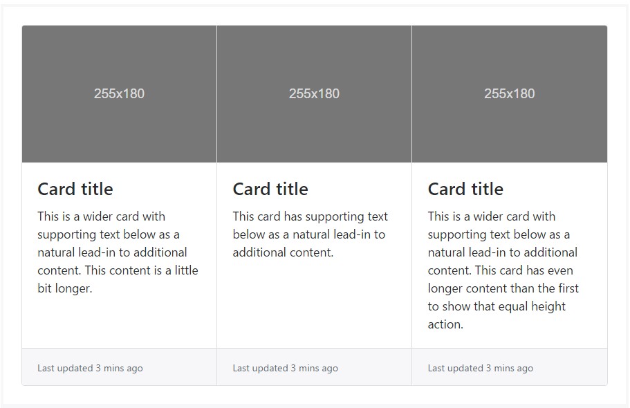
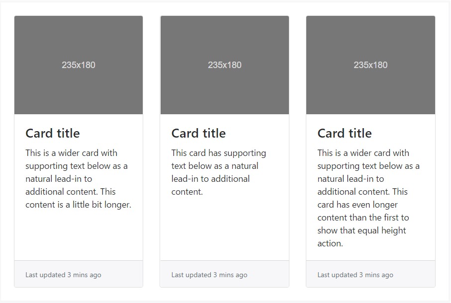
</div>Card decks
Required a set of equivalent width and height cards that aren't attached to one another? Use card decks.
<div class="card-deck">
  <div class="card">
    <div class="img"><img class="card-img-top" src="..." alt="Card image cap"></div>
    <div class="card-block">
      <h4 class="card-title">Card title</h4>
      <p class="card-text">This is a longer card with supporting text below as a natural lead-in to additional content. This content is a little bit longer.</p>
      <p class="card-text"><small class="text-muted">Last updated 3 mins ago</small></p>
    </div>
  </div>
  <div class="card">
    <div class="img"><img class="card-img-top" src="..." alt="Card image cap"></div>
    <div class="card-block">
      <h4 class="card-title">Card title</h4>
      <p class="card-text">This card has supporting text below as a natural lead-in to additional content.</p>
      <p class="card-text"><small class="text-muted">Last updated 3 mins ago</small></p>
    </div>
  </div>
  <div class="card">
    <div class="img"><img class="card-img-top" src="..." alt="Card image cap"></div>
    <div class="card-block">
      <h4 class="card-title">Card title</h4>
      <p class="card-text">This is a wider card with supporting text below as a natural lead-in to additional content. This card has even longer content than the first to show that equal height action.</p>
      <p class="card-text"><small class="text-muted">Last updated 3 mins ago</small></p>
    </div>
  </div>
</div>
Like with card groups, card footers in decks should automatically line up.
<div class="card-deck">
  <div class="card">
    <div class="img"><img class="card-img-top" src="..." alt="Card image cap"></div>
    <div class="card-block">
      <h4 class="card-title">Card title</h4>
      <p class="card-text">This is a wider card with supporting text below as a natural lead-in to additional content. This content is a little bit longer.</p>
    </div>
    <div class="card-footer">
      <small class="text-muted">Last updated 3 mins ago</small>
    </div>
  </div>
  <div class="card">
    <div class="img"><img class="card-img-top" src="..." alt="Card image cap"></div>
    <div class="card-block">
      <h4 class="card-title">Card title</h4>
      <p class="card-text">This card has supporting text below as a natural lead-in to additional content.</p>
    </div>
    <div class="card-footer">
      <small class="text-muted">Last updated 3 mins ago</small>
    </div>
  </div>
  <div class="card">
    <div class="img"><img class="card-img-top" src="..." alt="Card image cap"></div>
    <div class="card-block">
      <h4 class="card-title">Card title</h4>
      <p class="card-text">This is a wider card with supporting text below as a natural lead-in to additional content. This card has even longer content than the first to show that equal height action.</p>
    </div>
    <div class="card-footer">
      <small class="text-muted">Last updated 3 mins ago</small>
    </div>
  </div>
</div>
Card columns
Cards are ordered from top to bottom and left to.
Carry on! Your distance with card columns may vary. To avoid cards breaking across columns, set them to display: inline-block as column-break-inside: avoid isn't a bulletproof solution yet.
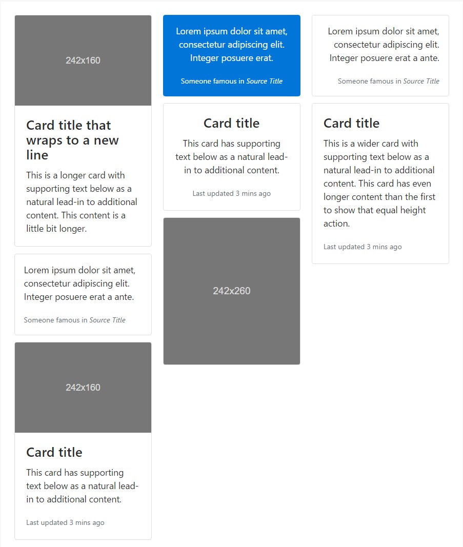
<div class="card-columns">
  <div class="card">
    <div class="img"><img class="card-img-top img-fluid" src="..." alt="Card image cap"></div>
    <div class="card-block">
      <h4 class="card-title">Card title that wraps to a new line</h4>
      <p class="card-text">This is a longer card with supporting text below as a natural lead-in to additional content. This content is a little bit longer.</p>
    </div>
  </div>
  <div class="card p-3">
    <blockquote class="card-block card-blockquote">
      <p>Lorem ipsum dolor sit amet, consectetur adipiscing elit. Integer posuere erat a ante.</p>
      <footer>
        <small class="text-muted">
          Someone famous in <cite title="Source Title">Source Title</cite>
        </small>
      </footer>
    </blockquote>
  </div>
  <div class="card">
    <div class="img"><img class="card-img-top img-fluid" src="..." alt="Card image cap"></div>
    <div class="card-block">
      <h4 class="card-title">Card title</h4>
      <p class="card-text">This card has supporting text below as a natural lead-in to additional content.</p>
      <p class="card-text"><small class="text-muted">Last updated 3 mins ago</small></p>
    </div>
  </div>
  <div class="card card-inverse card-primary p-3 text-center">
    <blockquote class="card-blockquote">
      <p>Lorem ipsum dolor sit amet, consectetur adipiscing elit. Integer posuere erat.</p>
      <footer>
        <small>
          Someone famous in <cite title="Source Title">Source Title</cite>
        </small>
      </footer>
    </blockquote>
  </div>
  <div class="card text-center">
    <div class="card-block">
      <h4 class="card-title">Card title</h4>
      <p class="card-text">This card has supporting text below as a natural lead-in to additional content.</p>
      <p class="card-text"><small class="text-muted">Last updated 3 mins ago</small></p>
    </div>
  </div>
  <div class="card">
    <div class="img"><img class="card-img img-fluid" src="..." alt="Card image"></div>
  </div>
  <div class="card p-3 text-right">
    <blockquote class="card-blockquote">
      <p>Lorem ipsum dolor sit amet, consectetur adipiscing elit. Integer posuere erat a ante.</p>
      <footer>
        <small class="text-muted">
          Someone famous in <cite title="Source Title">Source Title</cite>
        </small>
      </footer>
    </blockquote>
  </div>
  <div class="card">
    <div class="card-block">
      <h4 class="card-title">Card title</h4>
      <p class="card-text">This is a wider card with supporting text below as a natural lead-in to additional content. This card has even longer content than the first to show that equal height action.</p>
      <p class="card-text"><small class="text-muted">Last updated 3 mins ago</small></p>
    </div>
  </div>
</div>
Card columns may additionally be extended and personalized with some added code. Shown listed below is an expansion of the .card-columns course making use of the exact same CSS-- CSS columns-- to generate a set of receptive tiers for changing the variety of columns.
.card-columns
  @include media-breakpoint-only(lg)
    column-count: 4;

  @include media-breakpoint-only(xl)
    column-count: 5;
Conclusions
Thus essentially this is the way the bright new to Bootstrap 4 card element becomes simply set up. As always aiming for ease and simplicity the new framework version integrates the performance of a few elements into a singular and powerful one. Right now you need to pick up the features you need to be outlined in some cards.
Check out a couple of video clip tutorials regarding Bootstrap Panel Border:
Connected topics:
Bootstrap Panel-Cards: main documents
Insights on just how can we set up Bootstrap 4 cards just the identical height?
Needing past panel look for cards