Bootstrap Alert Box
Intro
The alerts are offered by all these components you even do not remember as far as you truly get to require them. They are put to use for providing prompt in time responses for the user working with the web site hopefully aiming his or hers focus on a specific direction or evoking certain actions.
The alerts are most commonly used along with forms to give the user a tip if a field has been submitted wrongly, which is the correct format expected or which is the condition of the submission just after the submit button has been clicked.
As a lot of the elements in the Bootstrap framework the alerts also do have a well-kept predefined appearance and semantic classes which are used according to the particular case where the Bootstrap Alert Jquery has been displayed on screen. Considering that it's an alert message it's important to grab user's attention but after all leave him in the zone of comfort nevertheless it might even be an error notification.
This gets achieved by use of gentle pastel colours each being intuitively been connected to the semantic of the message information like green for Success, Light Blue for basic info, Light yellow seeking for user's attention and Mild red indicating there is actually something wrong.
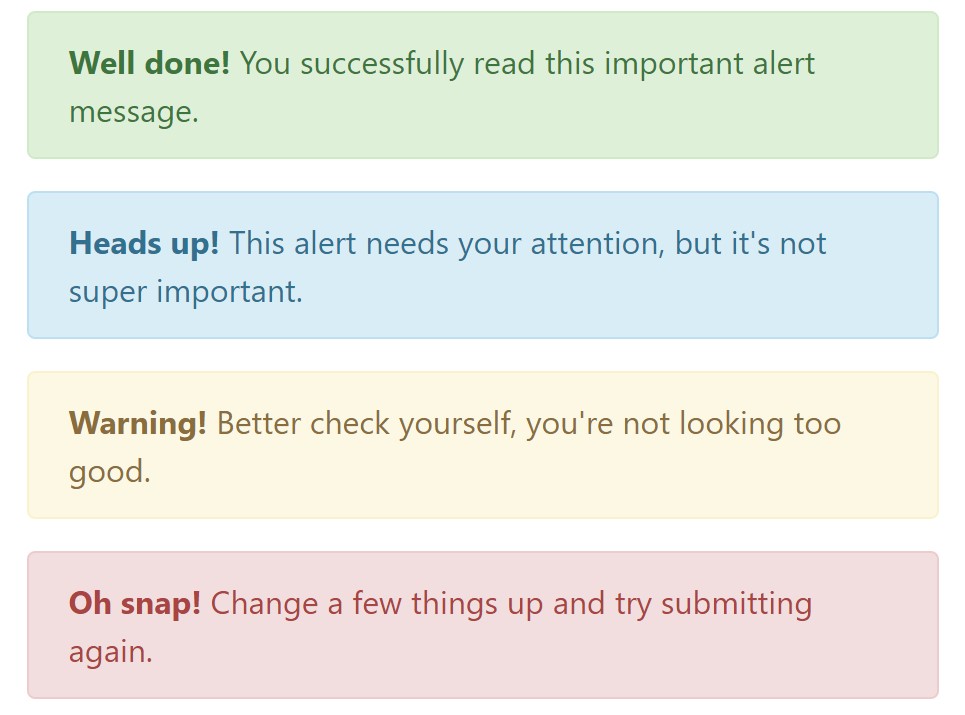
<div class="alert alert-success" role="alert">
  <strong>Well done!</strong> You successfully read this important alert message.
</div>
<div class="alert alert-info" role="alert">
  <strong>Heads up!</strong> This alert needs your attention, but it's not super important.
</div>
<div class="alert alert-warning" role="alert">
  <strong>Warning!</strong> Better check yourself, you're not looking too good.
</div>
<div class="alert alert-danger" role="alert">
  <strong>Oh snap!</strong> Change a few things up and try submitting again.
</div>
Colour of the link
This might not be spotted at a quick look but the font colour itself is in fact following this colour scheme too-- just the color options are much much darker so get unconsciously takened as black but the truth is it's not exactly so.
Exact same works not only for the alert message itself but as well for the web links included in it-- there are link classes removing the outline and coloring the anchor elements in the correct color so they suit the overall alert message appearance.
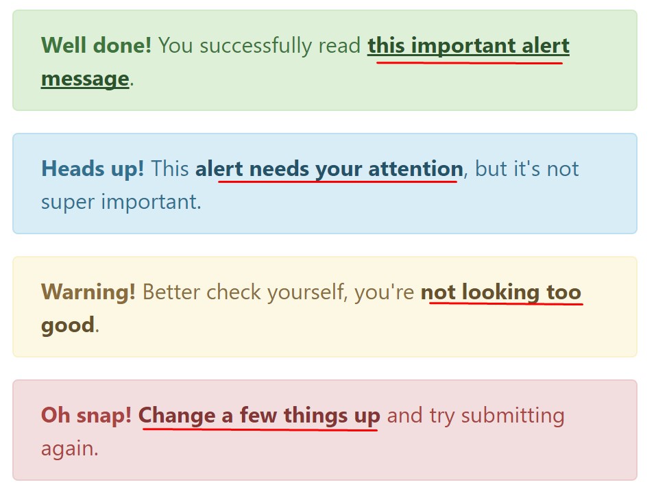
<div class="alert alert-success" role="alert">
  <strong>Well done!</strong> You successfully read <a href="#" class="alert-link">this important alert message</a>.
</div>
<div class="alert alert-info" role="alert">
  <strong>Heads up!</strong> This <a href="#" class="alert-link">alert needs your attention</a>, but it's not super important.
</div>
<div class="alert alert-warning" role="alert">
  <strong>Warning!</strong> Better check yourself, you're <a href="#" class="alert-link">not looking too good</a>.
</div>
<div class="alert alert-danger" role="alert">
  <strong>Oh snap!</strong> <a href="#" class="alert-link">Change a few things up</a> and try submitting again.
</div>
More important information for alerts
A thing to take note-- the color tones offer their clear interpretation only for those who actually get to notice them. In this way it's a good thing to either be sure the visible text itself brings the meaning of the alert well enough or to eventually incorporate certain extra information to only be seen by the screen readers if you want to offer the page's accessibility .
Together with links and simple HTML tags like strong for example the alert elements in Bootstrap 4 can also include Headings and paragraphs for the circumstances when you want to showcase a bit longer information.
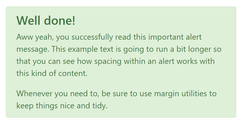
<div class="alert alert-success" role="alert">
  <h4 class="alert-heading">Well done!</h4>
  <p>Aww yeah, you successfully read this important alert message. This example text is going to run a bit longer so that you can see how spacing within an alert works with this kind of content.</p>
  <p class="mb-0">Whenever you need to, be sure to use margin utilities to keep things nice and tidy.</p>
</div>
Reject the alert
Once more ensure the visual comfort of the visitors, you can also add an X icon to dismiss the alert and add a cool transition to it to.
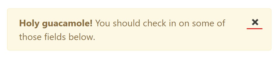
<div class="alert alert-warning alert-dismissible fade show" role="alert">
  <button type="button" class="close" data-dismiss="alert" aria-label="Close">
    <span aria-hidden="true">×</span>
  </button>
  <strong>Holy guacamole!</strong> You should check in on some of those fields below.
</div>
There are four varieties of contextual alert messages in Bootstrap 4 framework - they are called Success, Info, Warning and Danger. Do not allow however their titles to narrow down the manner in which you're working with them-- all of these are just a number of color schemes and the method they will be really performed in your website is absolutely up to you and fully depends on the individual scenario.
-- if the color scheme of your page utilizes the red as main color it might be quite appropriate to display the alert for successful form submission in red too using the predefined alert danger appearance in order to better blend with the page and save some time defining your own classes.
After all the predefined alert classes are nothing but some consistent appearances and the responsibility for using them lays entirely on the designer's shoulders.
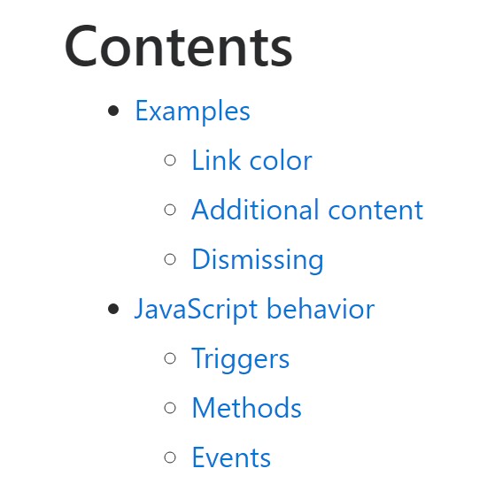
JavaScript behavior of the Bootstrap Alert Jquery
Triggers
Enable dismissal of an alert by using JavaScript
$(".alert").alert()
Enable termination of an alert using JavaScript
Or perhaps with data attributes on a button located in the alert, as shown above
<button type="button" class="close" data-dismiss="alert" aria-label="Close">
  <span aria-hidden="true">×</span>
</button>
Note that closing an alert will remove it from the DOM.
Techniques
$().alert() - Helps to make an alert listen for click events on descendant elements which have the data-dismiss=" alert" attribute. (Not important while using the data-api's auto-initialization.).
$().alert('close') - Closes up an alert through eliminating it from the DOM. If the.fade and.show classes are present on the element, the alert will die just before it is eliminated.
Events
Bootstrap's alert plugin makes vulnerable a couple of events for fastening into alert capability.
close.bs.alert- This kind of event fires promptly when the shut instance way is called.
closed.bs.alert- When the alert has been closed (will wait for CSS transitions to, this event is fired).
Take a look at a couple of video training about Bootstrap alerts
Linked topics:
Bootstrap alerts: official documentation
W3schools:Bootstrap alert tutorial
Best Free AI Website Builder
Generate AI websites with a simple prompt!
Type in any language, export in zip.
Best Free Website Builder Software
Create awesome websites offline!
No coding. 9900+ templates.
Edit and save locally, upload wherever.
Free website builder download
for Win, Mac, Linux!
Best Website Templates

HTML Business Templates

Web Design HTML Templates

HTML eCommerce Website Template

Hotel HTML Template

Landing Page HTML Template

Premium Design HTML Themes

HTML Resume Template

Online Shopping HTML Template